Introduction
Brief
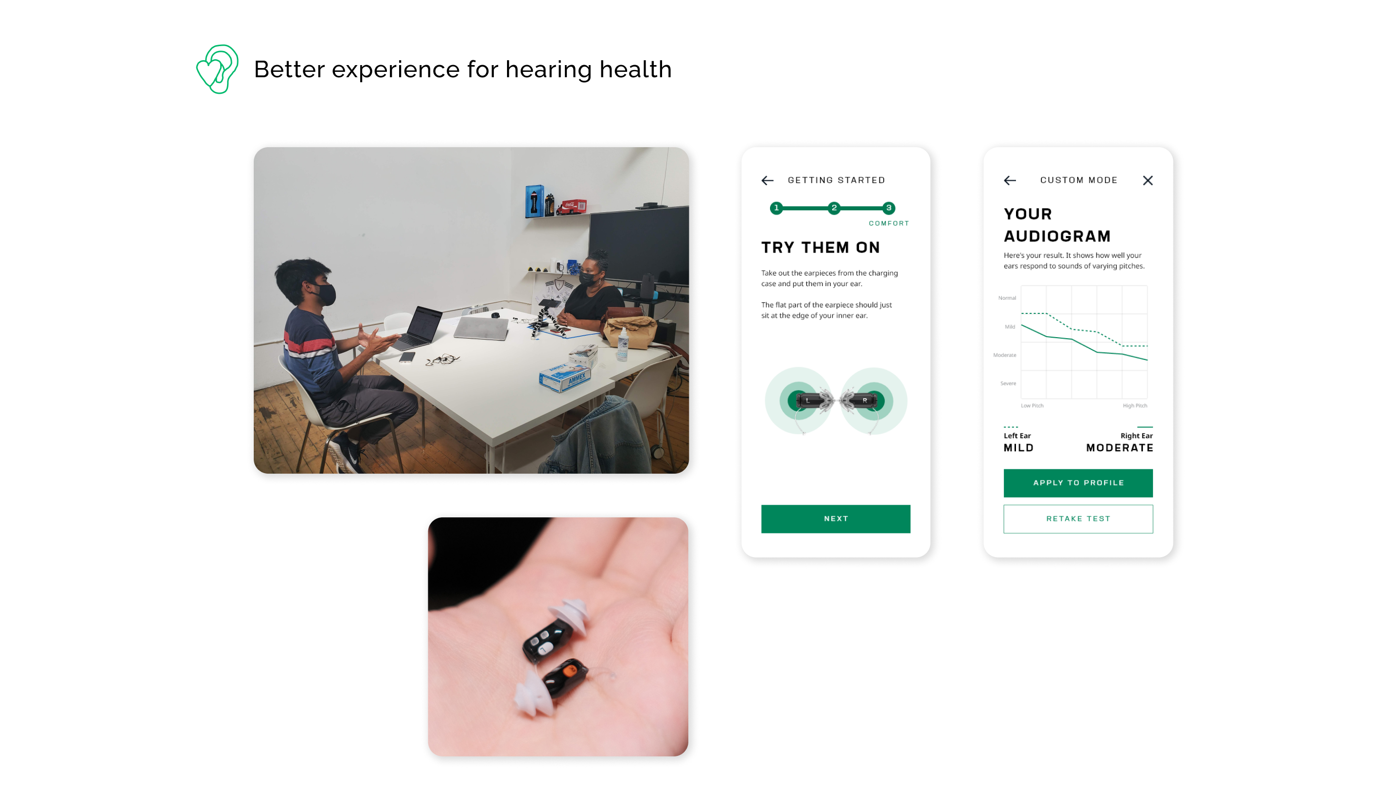
Zepp Health (which sits under the larger Huami brand) wanted to launch its first hearing aid in the US. They needed a digital product experience and MVP strategic recommendations to better position themselves in the market. Because of the design-led foundational work my team and I did for them, they won the Red-Dot Product Design Award in 2022. View the full case study here.
Role
MVP Product Roadmap, Market analysis, mid-fidelity mobile prototypes, POC usability testing
Duration
4 months.
4 months.
Design Skills
Usability Testing, Competitive Audit, Research Synthesis, User Flows, Product Strategy, Prototyping
The Current State
Problem Context
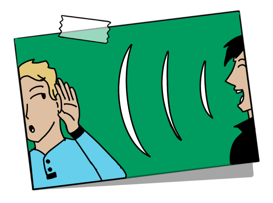
Hearing loss currently affects 45 million in the US and is the third most common chronic disease as pointed out by the CDC. Those who are affected are unable to seek out help because of a lack of awareness and the expensive costs associated with medical hearing devices.
According to a study from WHO and Apple:
700 mil
people are expected to experience profound hearing loss by 2050
25%
experience a daily average environmental sound exposure that is higher than the recommended limit
50%
haven’t had their hearing tested by a professional in at least 10 years
Scanning out the competition
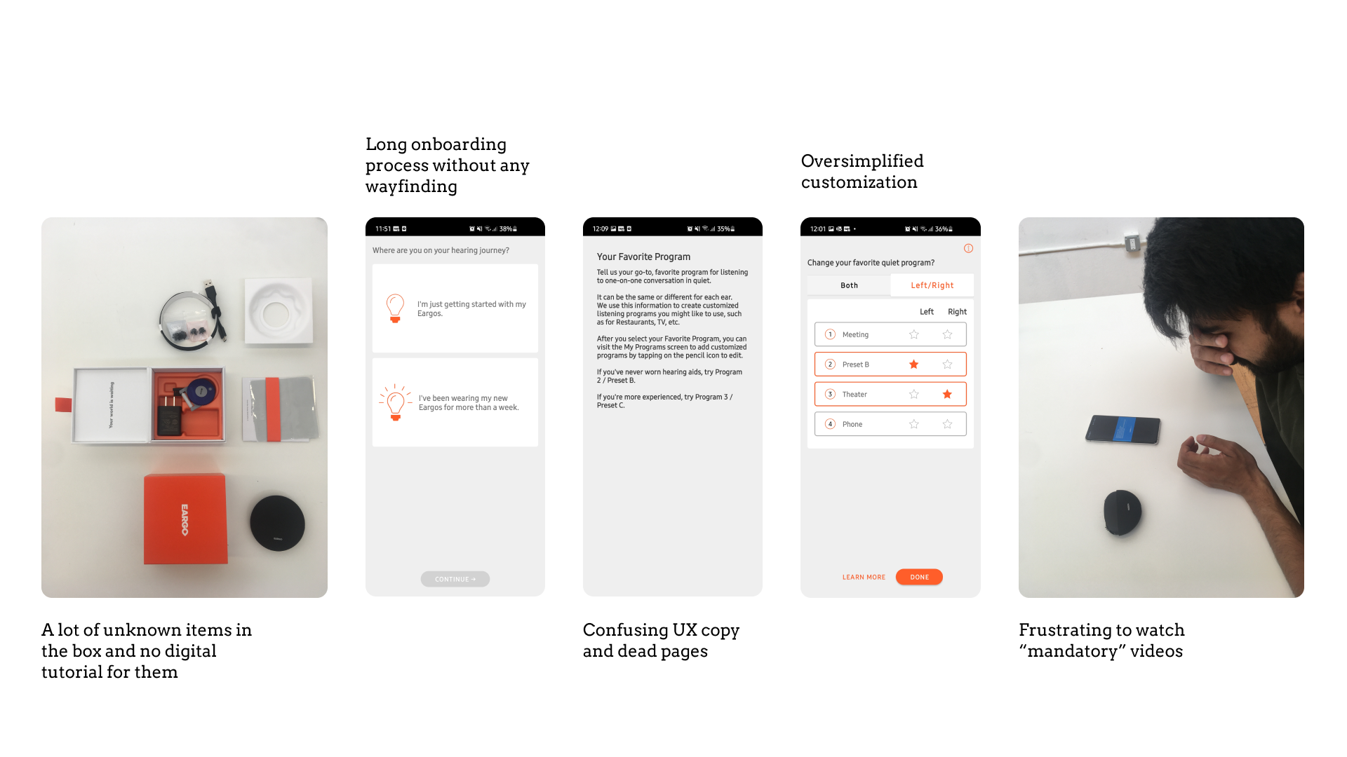
Key Pain Points
Lack of Awareness
The majority of hearing impaired don’t know that they are affected unless the problem is severe.
Lack of Product Options
Users are forced to test and buy from audiologists who only recommend affiliated brands.
Lack of Self-Managed UX
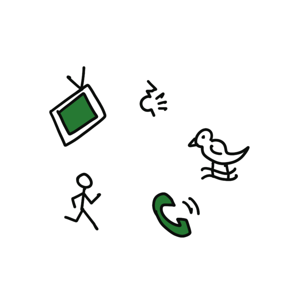
Any customization for a particular scenario (watching TV, calling, walking outside, etc.) requires external help.
Hypothesis
How might we create an intuitive onboarding and customization experience, such that users will be more likely to adopt our product over competitors?
Design Execution
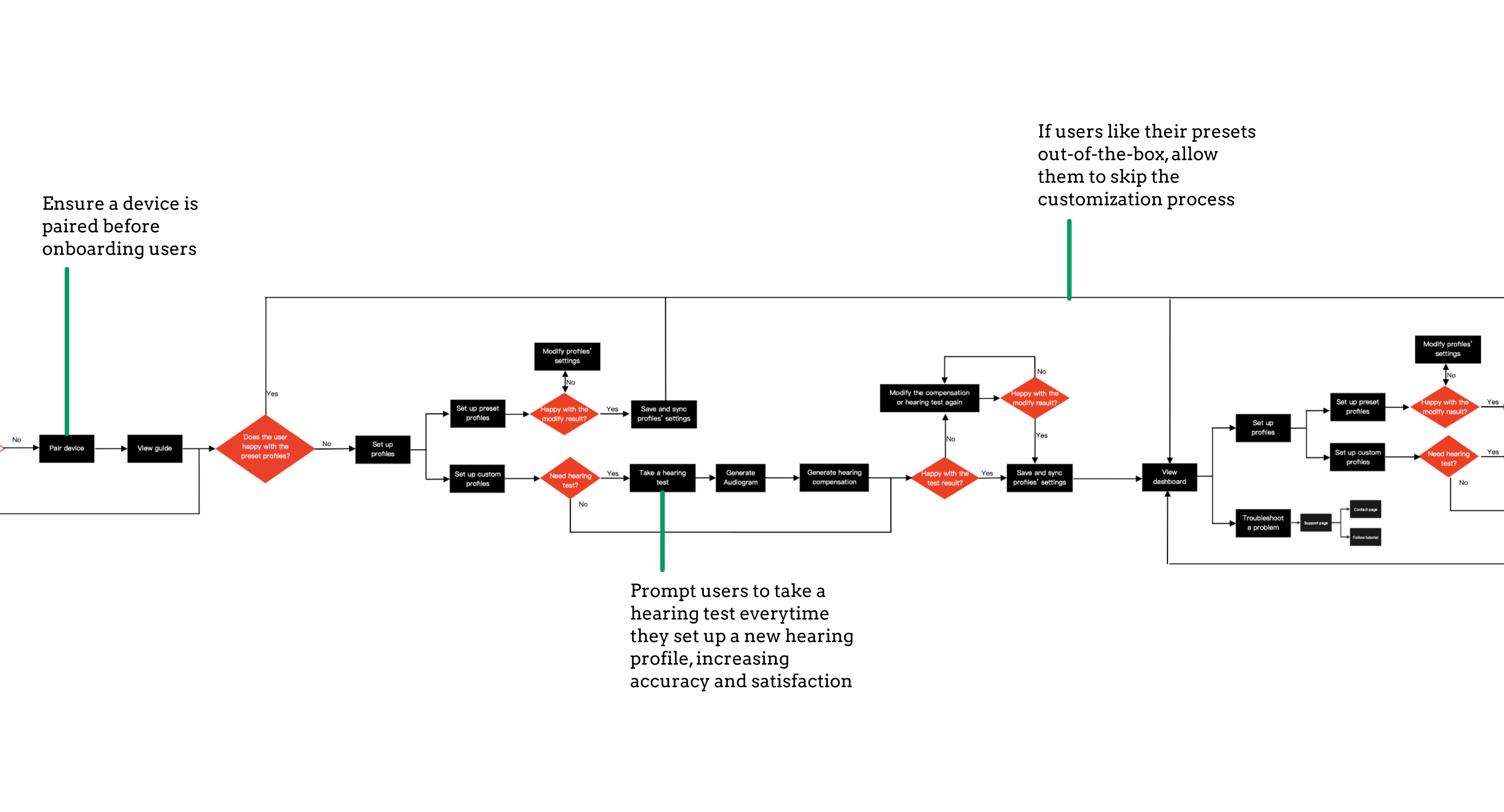
User flow for a shorter Time To Value (TTV)
Based on the market analysis, I drafted the "current UX" and started to make iterations - these were partly based on mistakes other brands were making and what fit best in Zepp Health's context. My iterations resulted in a quicker time to value that brought the wow factor into the experience.
Mid-Fidelity Wireframes + Thunkable Prototype
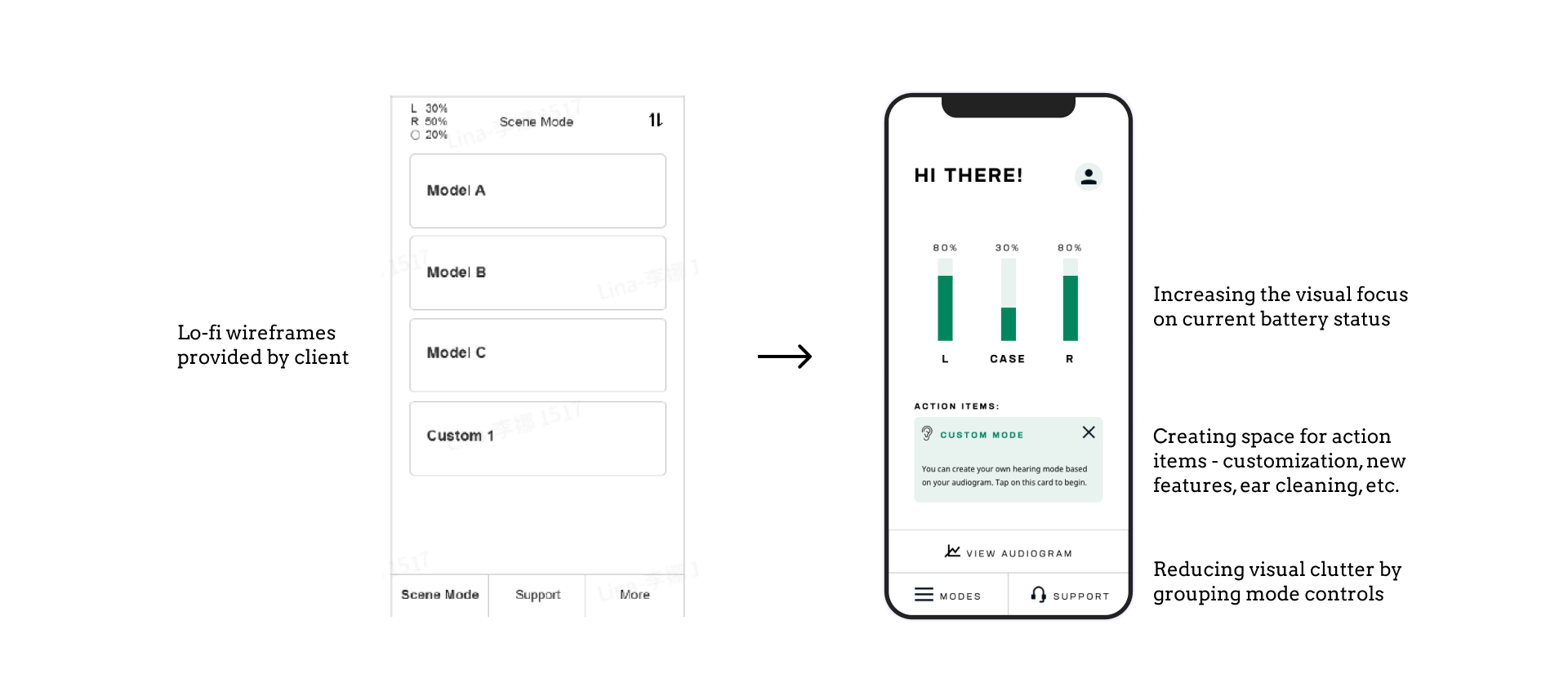
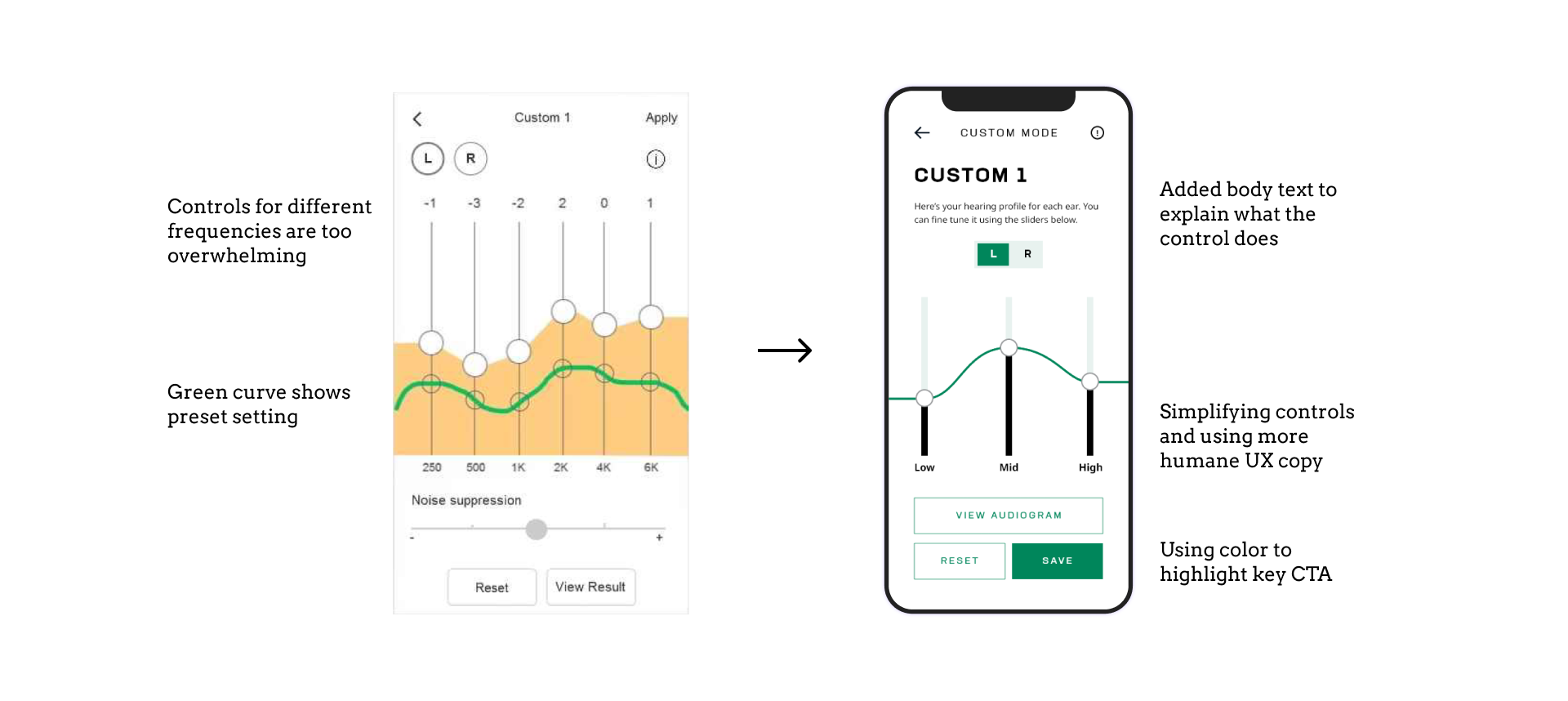
Zepp's team had provided us with a "key interactions" document (left), which I used to build upon better wireframes for the POC testing (right).
Proof of Concept (POC) Testing
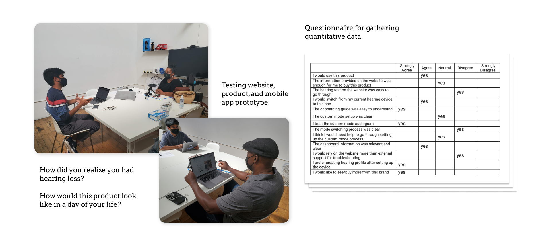
We invited 15 people with mild-moderate hearing loss, asked them qualitative questions to understand their journey and pain points and we tested the prototype hearing aids, the mid-fidelity mobile app, and the high-fidelity prototype website screens. We made iterations on wireframes based on that and presented them to the client for MVP product recommendations.
Success
App / Website Launched
With our strategic and design support, Zepp Health successfully launched the hearing aid in 2022 Spring as Clarity One, ahead of the FDA’s ruling on hearing aids being OTC and being more accessible.
Later that year Zepp Health won the Red Dot Product Design Award in the hearing aid category. The app has been already downloaded 1000+ times.
Scan the QR code to see the app on the Apple iOS Store. Click here for the Google Play Store version.
Learnings
Despite a minor contribution to the grand strategy, I continually strived to exceed the client’s expectations while championing the human-centric approach. I’m glad this is a piece of public evidence I can confidently point my design contribution towards.
It gives me ethical satisfaction to have used my design skills towards destigmatizing hearing loss and for the greater good.
Other Projects
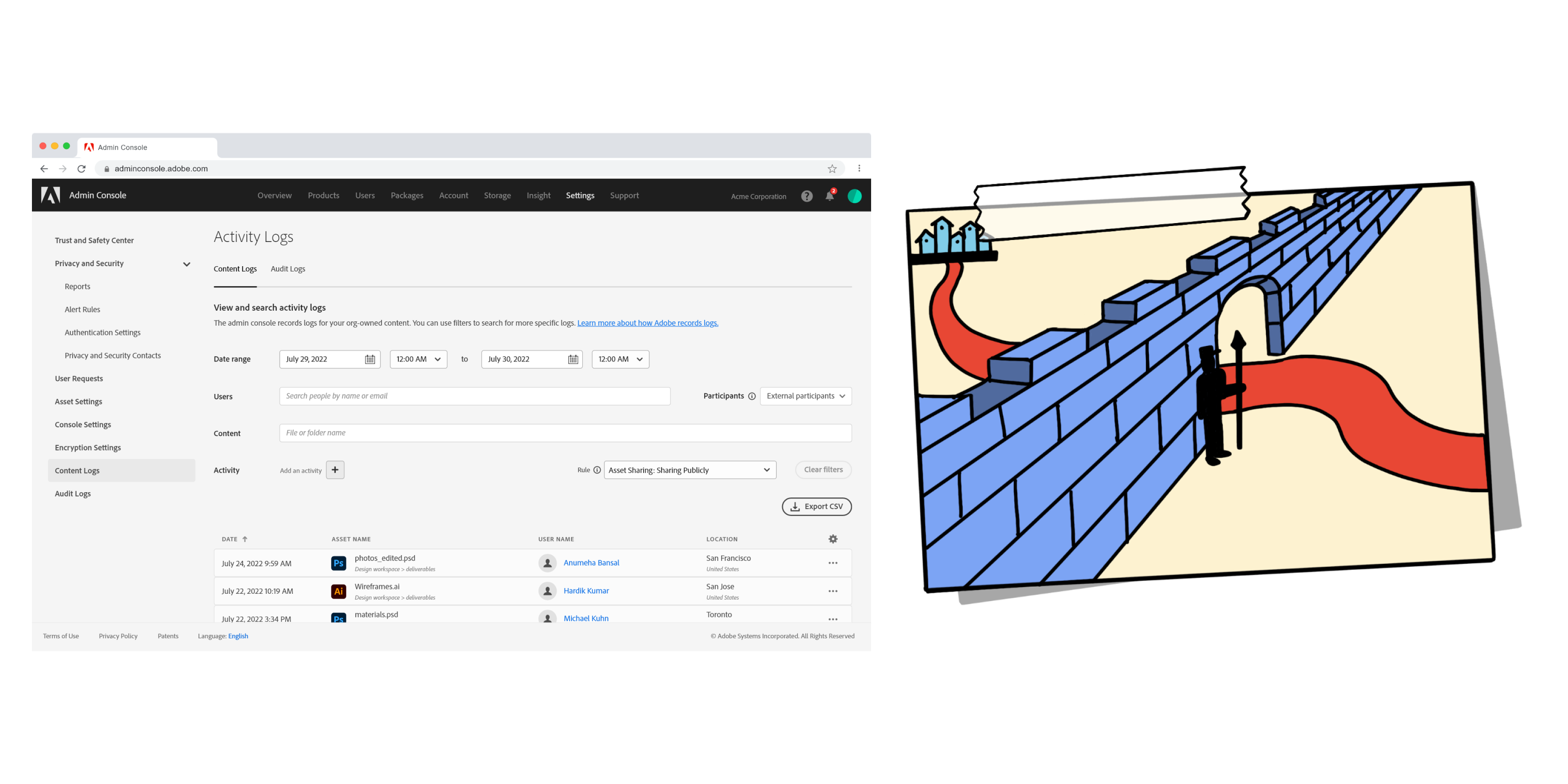
AdobeBetter admin console UI, leading to higher task completion rate and $100k+ future innovation budget
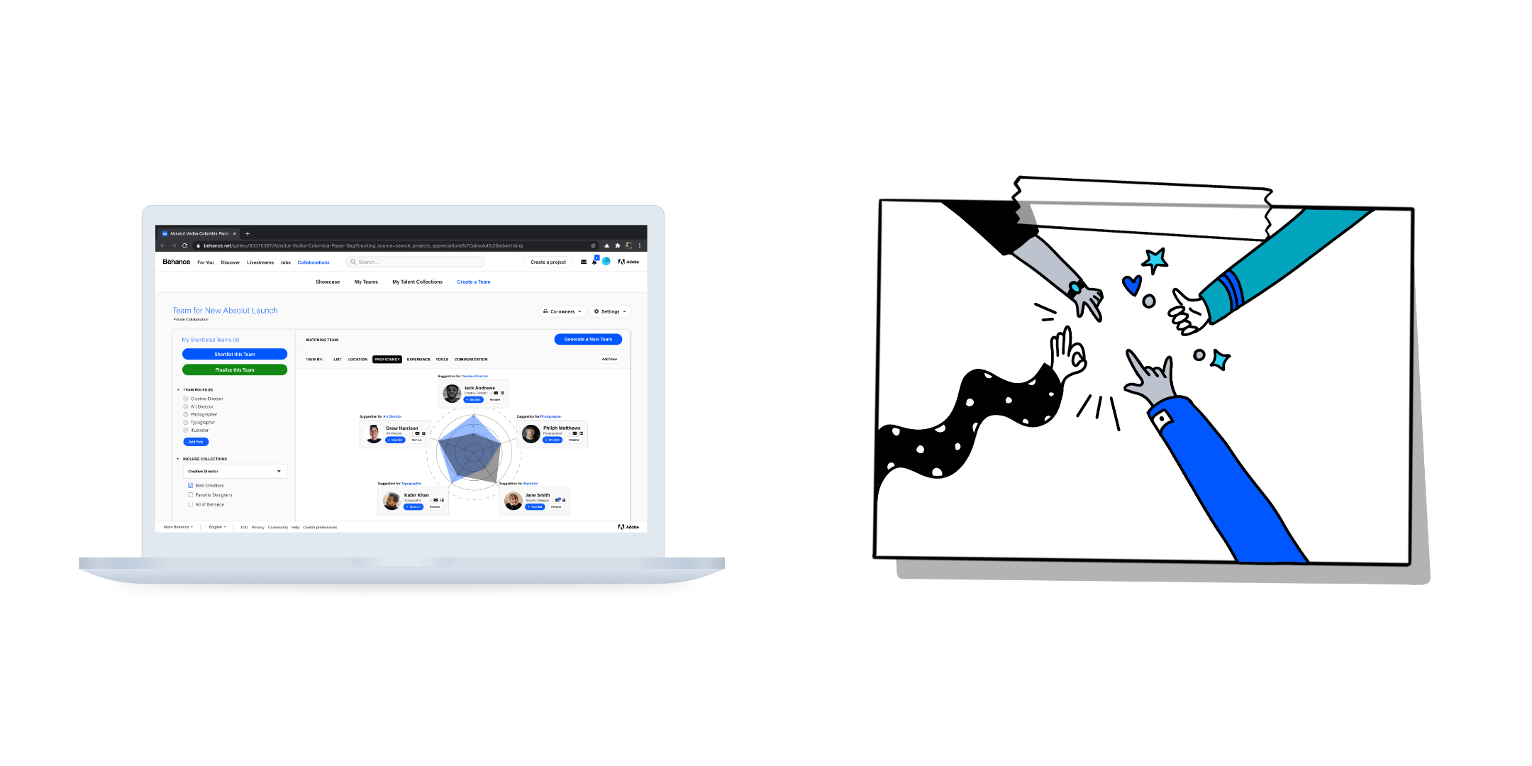
Behance Co-Lab (CCA case study)Creative talent community builder, leading to more synergy in collaboration

(Yes, people do use Outlook too.)
Copyright © Hardik Kumar. All illustrations are hand-crafted (with an enormous amount of care) so please use them with credit and for educational purposes only. Thanks!
Copyright © Hardik Kumar. All illustrations are hand-crafted (with an enormous amount of care) so please use them with credit and for educational purposes only. Thanks!
Made with ✍︎ Space Grotesk, ❤︎ and Semplice.
Made with ✍︎ Space Grotesk, ❤︎ and Semplice.
No ✂︎ post-its were harmed during the making of this website.